Options Trading Dashboard: 8 Features That Actually Matter
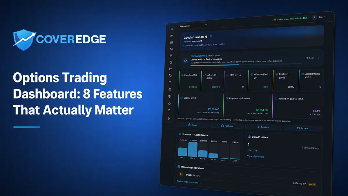
Key takeaway
The features that make an options dashboard genuinely useful aren't the flashiest ones. For covered call, cash-secured put, and wheel sellers, the eight that matter are: a decision queue that surfaces positions needing attention first (expiring, in-the-money, earnings-adjacent); complete trade-lifecycle handling across open, close, expire, assign, and roll; roll-chain continuity that carries cumulative economics across every adjustment; ledger-backed net P&L where premiums, close debits, assignments, and fees don't drift; market-data freshness with visible timestamps instead of fake streaming; portfolio and account separation so taxable and IRA numbers stay tax-accurate; capital- and time-aware performance metrics like return on capital, annualized ROI, and dollars-per-day rather than win rate alone; and auditable brokerage sync with deduplication, import previews, and an explicit manual path. Widget overload, streaming everything, opaque scores, and AI prose with no source trail look impressive in a demo but rarely make you a better seller. The test: whether the dashboard tells you what to look at, keeps an accurate record of what you did, and lets you trace any number back to its source.
Track your covered call & cash-secured put income with ledger-grade P&L in CoverEdge — free 14-day Pro trial, no card.
Start free trialShop for an options tracking tool and every product page leads with a screenshot of a dense, glowing dashboard — a dozen widgets, streaming tickers, colored gauges. It looks powerful. But a dashboard’s job isn’t to look busy; it’s to tell you what needs a decision today, keep an accurate record of what you’ve already done, and let you trace any number back to its source. Judged that way, most of the flashy widgets don’t earn their space. Here are the eight features that actually matter for running a covered call, cash-secured put, or wheel strategy — and the impressive-looking ones that don’t.
Try the math on a real ticker — for free
Plug in any of 200+ tickers and get live premium, annualized yield, breakeven, and assignment P&L instantly. No signup, no credit card.
What a Dashboard Is Actually For
An income seller doesn’t sit and watch a screen all day. You check in, you decide whether anything needs action, and you get on with your life. So the useful test for any options dashboard is three questions:
- Does it tell you what to look at? The positions that need a decision this week should be obvious in the first three seconds.
- Does it keep an accurate record of what you did? Your premium income, cost basis, and realized P&L should be right — and stay right after a dozen rolls.
- Can you trace any number back to its source? Every figure should be explainable, not an opaque score you have to trust.
Keep those three jobs in mind and the feature list below sorts itself into “matters” and “demo candy” quickly.
The 8 Features That Actually Matter
1. A decision queue, not just a position list
A raw table of every open position is a filing cabinet. What you need is triage: which positions are expiring this week, which are in the money and at risk of assignment, and which have earnings inside the expiration window. A good dashboard surfaces those first so the ten seconds you spend are spent on the right five positions. A grid you have to manually scan, sort, and interpret every time is making you do the software’s job. See how to track options expiration dates for the weekly-review habit this feature is built to support.
2. Complete trade-lifecycle handling
An options position isn’t a single event — it moves through open, close, expire, assign, and roll. A dashboard that only models “open” and “closed” forces you to hand-fudge everything in between, and that’s exactly where the accounting breaks. Assignment in particular has to be a first-class event, because it changes your share position and your cost basis at the same time. If a tool can’t record an assignment cleanly, it can’t keep your numbers honest.
3. Roll-chain continuity
This is the single feature that most separates a real options tracker from a repurposed stock app. When you roll a position eight times, that’s one economic story, not eight unrelated trades. A dashboard worth using links every roll into a chain and carries the cumulative net credit and P&L across all of them, so your true breakeven reflects every premium collected — not just the most recent leg. Most spreadsheets and generic trackers lose the thread here. Our guide to tracking rolled options as a roll chain covers why the cumulative number is the one that matters.
4. Ledger-backed net P&L
Your income and cost basis should be derived from a record of what actually happened, not re-estimated from a moving quote or typed into a formula that drifts. That means premium collected, buy-to-close debits, assignments, and — the field everyone forgets — fees on every leg all net together into a number you can trust at tax time. A dashboard that shows a big P&L figure but can’t tell you which trades produced it is showing you a guess. This is why CoverEdge is ledger-first: every figure traces back to an immutable entry.
5. Freshness with visible timestamps
Market context — underlying price, option bid/ask, delta, IV, moneyness — needs to be current when you’re evaluating a trade, but “current” means within a few minutes and clearly timestamped, not streamed tick-by-tick. Crucially, an honest dashboard tells you when data is delayed instead of labeling everything “live,” and it knows the difference between a moving market and a closed one. We wrote a whole piece on what actually needs to be real-time — the short version is that a timestamp you can see beats a “live” badge you have to take on faith.
6. Portfolio and account separation
A Roth, a taxable account, and a second broker have different tax treatment, so a single blended total hides more than it reveals. A dashboard that lets you keep each account distinct — while still switching between them in one place — is what keeps your realized gains, cost basis, and assignment history tax-accurate. Blending an IRA and a taxable account into one number feels tidy and quietly makes your tax picture wrong. See how to track options across multiple brokerage accounts for why separation beats a merged grand total.
7. Capital- and time-aware performance metrics
Win rate alone is a vanity metric — you can win 80% of your trades and still lose money to one expensive assignment. A dashboard that actually measures performance shows return on capital, annualized ROI, and dollars-per-day alongside a bounded rolling win rate, so you can see whether the income is worth the capital and risk you’re committing. A single green “you’re up” number tells you almost nothing. Our breakdown of the metrics worth tracking beyond win rate walks through each one.
8. Auditable brokerage sync
Automatic import is a genuine convenience — but only if it’s auditable. That means deduplication so re-running a sync doesn’t double-count trades, a preview of what’s about to be imported before it commits, and an explicit manual path for the times automation can’t infer your intent (was that a roll, or a close and a new open?). A sync that silently writes to your records with no preview and no way to correct it is a liability, not a feature. Read-only access — where the tool can see your trades but never place one — is the right trust boundary.
Features That Look Impressive but Usually Aren’t
Now the other side of the ledger. These demo beautifully and rarely make you a better seller:
- Widget overload. A screen so dense you can’t tell what needs attention isn’t powerful, it’s noise. More panels means more time spent figuring out where to look.
- Streaming everything. A tick-by-tick Level 2 feed is built for fast in-and-out day trading. Paying for (and staring at) it to run a monthly covered call is optimizing the wrong variable.
- Opaque scores. A single “opportunity score” with no way to see how it was calculated asks you to trust a black box with your capital. A number you can’t decompose is a number you can’t verify.
- AI commentary with no source trail. Plain-English analysis is genuinely useful — but only when it’s grounded in the same data you can see, and clearly framed as decision-support rather than a directive. AI prose that can’t point to its inputs is confident narration, not insight.
None of these are evil. They’re just optimized to win a five-minute demo, not to help you run a strategy correctly over months and years.
The 5-Minute Test for Any Options Dashboard
You don’t need a spreadsheet of feature checkboxes to evaluate a tool. Take one realistic position — a covered call you rolled twice, paid a fee on each leg, and were eventually assigned on — and see how the dashboard handles it:
| Ask the dashboard… | A weak tool | A tool built for income sellers |
|---|---|---|
| Show me what needs a decision this week | A full position list to scan yourself | A triaged queue: expiring, ITM, earnings-adjacent first |
| What’s my true P&L on this rolled position? | Each leg shown separately; you add it up | One roll-chain total, net of every leg and fee |
| What’s my cost basis after the assignment? | Unchanged, or you edit it by hand | Recalculated automatically from the ledger |
| How fresh is this quote? | “Live” badge, no timestamp | A visible timestamp; marked delayed when it is |
| Keep my IRA and taxable numbers separate? | One blended total | Per-account portfolios, switched in one place |
If a tool passes that single position cleanly, it will handle your whole book. If it stumbles on the rolled-and-assigned trade, no number of streaming widgets will save it.
How CoverEdge Approaches the Dashboard
CoverEdge is deliberately built around the eight features above rather than widget count. It’s ledger-first, so your premium income, cost basis, and realized P&L are derived from an immutable record instead of recomputed from live quotes; roll chains preserve cumulative economics across every adjustment; and each brokerage account maps to its own portfolio so taxable and IRA numbers stay separate and tax-accurate. The expiration review surfaces what needs a decision this week, market data is refreshed on a few-minute cadence during market hours and marked delayed when it isn’t live, and read-only brokerage sync (via SnapTrade) deduplicates on import with a preview and an explicit manual path. The free covered call calculator and screener let you try the data honesty before you ever sign up.
The takeaway isn’t that dashboards should be sparse — it’s that every element should earn its place by doing one of three jobs: tell you what to look at, keep an accurate record of what you did, and let you trace every number back to its source. A tool that nails those three beats a wall of streaming widgets every time.
Frequently asked questions
What features should an options trading dashboard have?
The features that matter for an income seller are a decision queue that surfaces positions needing attention first (expiring, in-the-money, earnings-adjacent), complete trade-lifecycle handling across open/close/expire/assign/roll, roll-chain continuity that carries cumulative P&L across adjustments, ledger-backed net income and cost basis that stay accurate net of fees, market-data freshness with visible timestamps, separation of each portfolio and account so the numbers stay tax-accurate, capital- and time-aware performance metrics (return on capital, annualized ROI, dollars-per-day), and auditable brokerage sync with deduplication and a manual fallback. A wall of streaming widgets is not one of them.
Do I need a real-time options dashboard?
For selling covered calls and cash-secured puts, you don't need tick-by-tick streaming. What matters is that the fields feeding a decision you might make today — underlying price, option bid/ask, delta, implied volatility, moneyness, and days to expiration — are current within a few minutes and clearly timestamped. A multi-week income position doesn't become a different decision because a quote moved a penny. A dashboard that honestly shows freshness (and marks data delayed when the market is closed) is more useful than one that labels everything 'live.'
What dashboard features look useful but usually aren't?
Widget overload (a screen so dense you can't tell what needs attention), streaming everything (paying for a day-trader feed to run a monthly covered call), opaque scores (a single number with no way to see how it was calculated), and AI commentary with no source trail. These demo well but rarely make you a better seller. The dashboard that helps is the one that tells you what to look at, keeps an accurate record of what you did, and lets you trace any number back to the trade that produced it.
How is CoverEdge's dashboard different?
CoverEdge is built around the eight features that matter rather than widget count. It's ledger-first, so premium income, cost basis, and realized P&L are derived from an immutable record instead of recomputed from live quotes; roll chains preserve cumulative economics across every adjustment; each brokerage account maps to its own portfolio so taxable and IRA numbers stay separate and tax-accurate; market data is refreshed on a few-minute cadence during market hours and marked delayed when it isn't live; and read-only brokerage sync (via SnapTrade) deduplicates on import with an explicit manual path. It's decision-support, not advice.
Track every premium dollar with CoverEdge
AI-enhanced research, assignment-aware roll analysis, and ledger-grade P&L that survives every roll, close, and assignment. Decision-support, not advice — you decide.
No credit card required · Cancel anytime