Covered Call Graph: How to Read a Payoff Diagram
Key takeaway
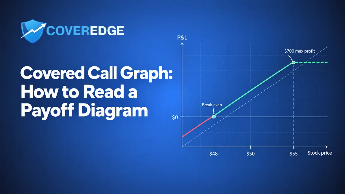
A covered call graph plots your profit or loss at expiration (vertical axis) against the stock price (horizontal axis, lower to the left). It has one shape: a loss where the stock falls, a diagonal that climbs through break-even as the stock rises, and a flat ceiling at and above the strike where profit is capped. Reading it gives you three numbers. Break-even is your cost basis minus the premium collected — below your basis because the premium lowered it. Maximum profit is (strike − cost basis + premium) × 100 — for an out-of-the-money call that is the premium PLUS the gain from your basis up to the strike, not the premium alone. Maximum loss is (cost basis − premium) × 100 if the stock goes to zero, because you still own the shares. The classic diagram shows expiration only; before expiration the live position sits off that line because the short call still carries time value that decays toward zero.
Track your covered call & cash-secured put income with ledger-grade P&L in CoverEdge — free 14-day Pro trial, no card.
Start free trialA covered call graph — the payoff diagram — plots your profit or loss at expiration against the stock price. It has one distinctive shape: a loss on the left where the stock falls, a diagonal that climbs through break-even as the stock rises, and a flat ceiling at and above the strike where your profit is capped. Reading it well tells you three numbers at a glance: your break-even price, your maximum profit, and how far the stock can fall before the premium stops cushioning you.
This guide is educational, not investment advice. Every price below is illustrative, and the examples ignore fees, taxes, dividends, and interest unless noted. Options involve risk and are not suitable for every investor.
Try the math on a real ticker — for free
Plug in any of 200+ tickers and get live premium, annualized yield, breakeven, and assignment P&L instantly. No signup, no credit card.
What a Covered Call Graph Shows
A covered call combines two positions: 100 shares of stock you own and one call option you sell against them. The graph draws the combined result of both legs at expiration. The horizontal axis is the stock price on expiration day — lower prices to the left, higher prices to the right. The vertical axis is your profit (above the zero line) or loss (below it) on the whole position.
Because you sold the call, your upside is capped: no matter how high the stock climbs, the shares get called away at the strike and your line goes flat. Because you still own the shares, your downside is nearly the full stock position, softened only by the premium you collected. The premium shifts the entire line upward by the amount you were paid — which is exactly why the break-even sits below your cost basis.
A Worked Example to Anchor the Graph
Use one position for the whole article so every number ties back to the same picture:
- You own 100 shares with a cost basis of $50 ($5,000 invested).
- You sell one 30-day $55 call and collect $2.00 per share — $200 in premium.
- Your break-even drops to $48 (cost basis $50 minus the $2 premium).
- Your maximum profit is $700: the $5-per-share gain from $50 up to the $55 strike ($500) plus the $200 premium.
- Your worst case is the stock going to $0: a $5,000 loss on the shares minus the $200 premium kept, or $4,800.
Covered Call P&L at Expiration
At lower stock prices you take a loss on the shares, cushioned by the $200 premium. As the stock rises the combined position climbs through the $48 break-even and keeps gaining up to the $55 strike. At and above the strike your profit is fixed (dashed) at $700 — premium plus the gain from your basis to the strike — because the shares get called away.
How to Read the Graph, Left to Right
The line only bends in two places — at break-even (where it crosses zero) and at the strike (where it goes flat). Those two kinks split the graph into four readable zones.
- Below $48 (the loss zone). The stock is below your break-even, so the combined position is underwater. You still own the shares, so every dollar the stock falls is a dollar of loss, offset only by the $200 premium you kept.
- At $48 (break-even). The premium exactly offsets the paper loss on the shares. This is where the line crosses zero, and it sits $2 below your $50 cost basis because the premium lowered it.
- Between $48 and $55 (the rising profit zone). Above break-even the line climbs with the stock: you keep the premium and capture the gain from your basis toward the strike. This is the sweet spot most covered call sellers aim for — the stock drifts up but does not blow through the strike.
- At and above $55 (the flat cap). The line goes flat at your $700 maximum profit. The shares are called away at $55, so any move above the strike is upside you agreed to give up in exchange for the premium.
The Scenario Table Behind the Curve
A payoff graph is just this table drawn as a line. Each row is the combined profit or loss at one expiration price for the $50-basis, $55-call, $2-premium position.
| Stock at expiration | Shares P&L | Premium kept | Total P&L |
|---|---|---|---|
| $40 | −$1,000 | +$200 | −$800 |
| $48 (break-even) | −$200 | +$200 | $0 |
| $50 (cost basis) | $0 | +$200 | +$200 |
| $55 (strike) | +$500 | +$200 | +$700 |
| $65 | +$500 (capped) | +$200 | +$700 |
Notice the last two rows are identical. Once the stock reaches the strike, the shares are sold at $55 no matter how high the price goes, so the total stops climbing. That is the flat line on the right of the graph — the visual signature of a capped strategy.
The Formulas the Graph Is Drawing
Four formulas define every covered call graph. They are what the line is made of:
| Number | Formula |
|---|---|
| Break-even | Cost basis − premium per share |
| Maximum profit | (Strike − cost basis + premium) × 100 |
| Maximum loss | (Cost basis − premium) × 100 (if the stock goes to $0) |
| P&L below the strike | (Stock − cost basis + premium) × 100 |
For the full set of return figures the graph implies — premium yield, annualized return, and the if-called-away result — see how to calculate covered call returns.
Covered Call vs Owning the Stock Alone
The clearest way to understand the shape is to lay it over the stock-only line, which is a simple 45-degree diagonal through your cost basis. The covered call takes that diagonal and does two things: it lifts the whole line up by the premium (helping on the downside and in the middle), and it flattens the line at the strike (hurting on a big rally). You are trading away the uncapped upside for a small, certain cushion and a defined maximum profit.
That trade-off is the entire strategy. If you expect the stock to rocket higher, the flat cap is a real cost — you would have done better just holding the shares. If you expect it to drift, stay flat, or dip slightly, the premium cushion and capped profit are exactly what you want. For the full downside picture, read the risks of selling covered calls.
The Expiration Graph vs Your Account Today
One subtlety trips up almost everyone the first time: the classic payoff diagram shows P&L at expiration only. Before expiration your position will not sit exactly on that line, because the call you sold still carries time value. If the stock jumps to $56 with two weeks left, the graph says you are at max profit, but your account may show less — the call still has extrinsic value you would have to pay to buy back, and it will not disappear until expiration.
Three forces pull the live position toward the expiration line as the days pass: time decay (which helps you, the seller), changes in implied volatility (a spike makes the short call more expensive to close), and any dividend or event inside the contract. This is why the expiration graph is a planning tool, not a live P&L readout. It tells you where you land if you hold to the end — not what your broker shows at 11 a.m. on a Tuesday.
Five Ways People Misread a Covered Call Graph
- Calling the premium the maximum profit. On an out-of-the-money call, max profit is the premium plus the gain from your basis to the strike. In the example that is $700, not $200. Only an at-the-money or in-the-money call makes the premium the whole story.
- Assuming an expired-worthless call means you made money. The call expiring worthless only means the stock finished below the strike. If it finished below your break-even, the combined position still lost money — the graph is below zero there.
- Forgetting the ×100 multiplier. Every point on the vertical axis is per-position, not per-share. A $2 premium is $200, and a $5 move is $500. Read the graph in contract dollars.
- Anchoring on the current price instead of your basis. The graph is drawn from your cost basis. Selling a $46 call when your basis is $50 locks in a loss on assignment, no matter how good the premium looks. Always place the strike relative to your basis — see how to pick a strike price.
- Reading the graph as a probability forecast. The payoff line shows the outcome at each price, not how likely each price is. Delta is the rough odds gauge; the graph is the consequences. Keep the two separate.
What Changes the Graph — and What Doesn't
The shape of a covered call graph never changes: loss on the left, rising middle, flat cap on the right. What moves is where the kinks sit and how high the cap is.
- A higher strike slides the cap to the right and raises maximum profit, but collects less premium, so the break-even cushion shrinks.
- A lower strike collects more premium (a deeper cushion, lower break-even) but caps profit sooner and raises assignment odds.
- More premium — from higher implied volatility or more days to expiration — lifts the whole line and lowers break-even, but usually comes with more risk.
Delta, DTE, and IV all change the premium and the odds, but they do not change the expiration payoff shape — they just reprice the contract and reposition the kinks.
See Your Own Graph, Then Track the Outcome
The fastest way to read a covered call graph on a real contract is to let a calculator draw it for you. The free covered call calculator computes premium, break-even, maximum profit, downside buffer, and the if-called-away result live for any of 200+ tickers, and the free covered call screener ranks setups by bid-based economics so the fattest headline premium does not float to the top on its own.
Once a trade is on, CoverEdge tracks every covered call through its full lifecycle — open, roll, assign, expire, or close — on a ledger-first accounting model, so your break-even, cost basis, and cumulative roll-chain P&L stay accurate no matter how the position evolves. The graph shows you the plan; the ledger keeps the real numbers honest. It does not give advice or place trades — you decide.
Frequently asked questions
How do you read a covered call payoff graph?
Read it left to right along the stock price. Below your break-even the combined position shows a loss, cushioned by the premium you collected. At break-even (your cost basis minus the premium) the line crosses zero. Between break-even and the strike the line rises with the stock. At and above the strike the line goes flat at your maximum profit, because the shares get called away at the strike and any move above it is upside you gave up for the premium. Every point on the vertical axis is per-position, so multiply per-share figures by 100.
What is the break-even point on a covered call graph?
Break-even is your stock cost basis minus the premium you collected per share. If your basis is $50 and you sold a call for $2, your break-even is $48 — the stock can fall to $48 before the combined position turns into a loss. It sits below your cost basis because the premium lowered it, which is why the whole payoff line is shifted upward compared with simply owning the stock.
What is the maximum profit on a covered call?
Maximum profit is (strike − cost basis + premium) × 100, reached at and above the strike. For a $50 basis, a $55 call, and a $2 premium, that is ($55 − $50 + $2) × 100 = $700. A common mistake is calling the premium the maximum profit — that is only true for an at-the-money or in-the-money call. On an out-of-the-money call, max profit is the premium plus the stock gain from your basis up to the strike.
Can a covered call lose money if the call expires worthless?
Yes. The call expiring worthless only means the stock finished below the strike, so you keep the shares and the premium. But if the stock finished below your break-even (cost basis minus premium), the combined position is still down — the payoff graph is below zero there. The premium cushions the decline but does not eliminate it, because you still own the shares and carry their full downside.
Track every premium dollar with CoverEdge
AI-enhanced research, assignment-aware roll analysis, and ledger-grade P&L that survives every roll, close, and assignment. Decision-support, not advice — you decide.
No credit card required · Cancel anytime